
Think big!
- Julia Woollams

- Dec 3, 2025
- 12 min read
Large-scale graphics and how size affects our design approach
As graphic designers, we work on projects that manifest themselves in different formats, whether it’s in digital or print media. Over the years I’ve created designs from the small (think favicons and postage stamps) to the big (think billboards and exhibitions panels) and even the massive (the largest I think, was an aeroplane) and of course many shapes and sizes in between.
We all have our preferred media and formats to design in and for some of us (especially those who primarily work in a digital realm) large-scale graphics may feel slightly out of our comfort zone. When I started out as a junior designer, the permanence of print was rather daunting, where any mistakes could be magnified and difficult to correct. One of my early jobs was a huge poster for the Paris Metro and I didn’t fully think through the implications of supplying percentage artwork, so the photographer’s credit placed vertically on an edge ended up reading more like a call to action, it was so massive…

I’ve recently finished an exhibition project where I very much had to focus on human dimensions and the physical space in relation to the designs (with a repeat pattern that I had recurring dreams about!), so I was interested in chatting with other creatives about how their approach might differ when thinking big, as well as any past traps they may have fallen into when designing to a large scale.
Thank you to Rose Cornish, Tommy Taylor, Leanne Kitchen and Robin Howie for sharing their experiences.
Rose Cornish

Rose is Creative Director at Imagist London – a female-led, independent branding and design studio. Small in size, the Imagist team works across a wide range of sectors, taking great pride in the idea at the core of every project and the craft employed to deliver them.
More on Rose: Imagist London's website; Imagist London's Instagram
The sooner you can understand the limitations you’re working within, the more time you have to create a design that not only embraces but benefits from those limitations.
Q1: In what ways might you approach a brief differently when the output is large scale?
Rose: Usually, the briefs we get for large scale work have a fixed physical setting or environment that needs to be taken into consideration alongside the function of the design. This could result in something that creates either harmony or discordance within that setting.
Sometimes the balance of harmonious to discordant shifts within the same project. If we’re designing internal graphics for a building, glazing manifestation usually needs to feel like an extension of the interior design. This requires us to work closely with the architects and interior designers, considering materials, colour and patterns already present in the physical space. For internal wayfinding however, the function in the space is different and needs to create a moment of disruption so that people take notice and can find their way around.
In both cases, the environment plays a huge role in the definition of the brief.

Q2: Do you find designing big, limiting or liberating?
Rose: I think the first stages of a large scale project are fuelled by the excitement of having space to fill but I find that fairly quickly I’m seeking the limitations to help guide the work. The function of the piece is usually the first one, who is looking at it, what do they need to understand, but also, what physical restrictions are there in the environment.
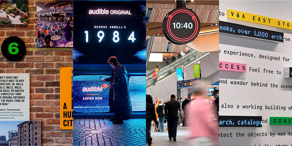
We did an exhibition in King’s Cross recently that chronicled the history and redevelopment of the area. We also created an audio guide and commissioned a case for an architectural model as the exhibition space was covered but exposed to the elements.
The space around the 5 metre model quickly became relatively small, the heritage brickwork meant we could only fix into mortar and the fact that it’s in the public realm restricts materials. These factors massively influenced the design, in some cases, a lot later than we would have liked. You need the phase of the project where you can put optimism first and design without constraint. However, the sooner you can speak to production partners and understand the limitations you’re working within, the more time you have to create a design that not only embraces but benefits from those limitations.

Q3: Are there any past mishaps you’ve had when creating large-scale graphics that you’d like to share, to help designers who might be new to designing big.
Rose: We’ve designed many hoardings in our time but an early job taught us two valuable lessons on photography, one about image quality and the other about licensing.
Generally for large scale artwork like billboards, you can get away with a much lower dpi than small scale print, so we followed a general rule of 100–150 dpi. However, when we exported our artwork at 50 percent scale, we didn’t account for the scaling up of the images. Unfortunately this particular hoarding ran alongside a pedestrian walkway as opposed to a road so our numbers blunder was pretty obvious on some of the lower resolution images.
We’ve also had an issue with the client supplying photography they thought they owned but hadn’t cleared for public realm use. The photographer saw their work on the hoarding and sent a handsome bill!
Tommy Taylor

As Creative Partner at Alphabetical, Tommy leads an award-winning team specialising in insight-driven, sensory branding and compelling language. A co-founder 15 years ago, Tommy built Alphabetical around a multi-sensory design ethos across brand identity, exhibition, environment, print, motion, packaging, and sound. His work spans arts, culture, charity, education, luxury hospitality, and property, working with clients including Amazon, BBC, BFI, British Council, National Theatre, Samsung, Science Museum and Unilever. Tommy studied at the celebrated Somerset College of Art, joining a distinguished lineage of graduates who now lead some of the world’s most creatively acclaimed studios. He works closely with communities, including local creative youth groups, and serves on the board of a local business district in London helping independent businesses thrive on the high street through branding and marketing advice, while regularly judging awards and supporting emerging creative talent.
More on Tommy: Linked in; Alphabetical's website; Alphabetical's Instagram
Environmental design is a sensory experience; it must command attention from afar and then draw people closer to explore.
Q1: In what ways might you approach a brief differently when the output is large scale?
Tommy: The approach is completely different.
When designing for large scale, the first step is always to visit the space or location. You need to inhabit it – to understand the light, flow, and perspective of how people will encounter the work. Environmental design is a sensory experience; it must command attention from afar and then draw people closer to explore.
When we took over Times Square for Audible’s reimagining of 1984, every element was designed with that layered experience in mind – bold enough to stand out in a landscape of noise, yet detailed enough to reward those who linger.
We also use the train platform test: if it captures attention from across the tracks, it’s working. At scale, design isn’t about detail – it’s about impact. The aim is always the same: to create something that stops you in your tracks, sparks curiosity, and invites you to step closer.

Q2: Do you find designing big, limiting or liberating?
Tommy: It’s totally liberating.
Designing big lets us do something different – to capture imagination on a grand scale. Every large-format brief is a chance to think differently. Over the years, we’ve brought 1984’s Big Brother to Times Square, created 10-metre-high concrete wildlife, and hand-painted a community’s voice through an entire underpass. Working at this scale invites experimentation — with sound, light, texture, scent, and motion — and gets us out of the studio to explore how people truly interact with design.
But with that freedom comes responsibility. Large-scale design must be for everyone, in harmony with its surroundings. It’s about balancing contrast and empathy, expression and restraint.
At its best, designing big is about equilibrium – bold yet subtle, playful but never distracting – transforming everyday spaces into experiences people don’t just see, but feel.

Q3: Are there any past mishaps you’ve had when creating large-scale graphics that you’d like to share, to help designers who might be new to designing big.
Tommy: Understanding materials is key when designing at scale.
Large-scale work is a delicate balance between pushing boundaries and staying practical – factoring in cost, durability, and health and safety. One memorable project was a new outdoor parade beneath an underpass in South London. The area, known for its brutalist concrete architecture, is also home to an unexpectedly rich diversity of wildlife – herons, peregrine falcons, hedgehogs, all thriving in the surrounding wetlands and brownfield spaces.
We worked with local communities to design 100m long facades that were over 10m tall, depicting these animals in dramatic 3D concrete, scaling across the walls. It looked incredible – until nature decided to join in. The real animals treated our creations as climbing frames and playgrounds, perfectly imitating the art we’d made to celebrate them.
The lesson? No matter how bold your concept, you must understand your materials and the environment – and plan for how real life might interact with your design.
Leanne Kitchen

Leanne is a Design Director at Design Bridge and Partners in London, from Northern roots in Yorkshire. Her passion is working with brands who truly want to make a difference locally or globally within their fields, with some of her past clients including, Cancer Research UK, Gen-All, University of the Arts London and Action Against Hunger.
More on Leanne: Instagram
By not having any type of format to be restricted by as a starting point, it completely opened up the team's way of thinking about the output of something which is usually very traditional.
Q1: In what ways might you approach a brief differently when the output is large scale?
Leanne: Designing at larger sizes will always have that level of physical interaction with the public, so whether that is for functional wayfinding, or a creative wall graphic, firstly there's the question of simply the visibility of the piece at the different heights and distances.
Obviously if there's functional text included, we need to consider the accessible distances for it to be read, for example on a recent project at Design Bridge and Partners for the new Rail Clock which launched at London Bridge Station last month. We researched extensively into the distances which the public would enter the station from and at the height the clock is displayed at, to help us determine the most appropriate sizing for the numbers on the clock face. So when there's a functional angle to the design, as in this case, helping people quickly tell the time walking through a busy station to find their train, this aspect is really key to have in mind when we get started.

Q2: Do you find designing big, limiting or liberating?
Leanne: I personally find it really liberating, as to me it feels like a sigh of relief if I read a brief which doesn't have the regular formats we design to daily.
In the past I've felt that relief quickly turn into pure excitement if the dimensions, ratios etc are completely undefined and it's part of the design thinking on how best to use that huge canvas, which can have irregular shapes, angles and depths.
I remember years ago as a Junior Designer at True North, where we designed our version of the office’s Christmas ‘card’, which instead of the usual printed piece posted through your door, used printed vinyls on the 24 windows of our building as a giant advert calendar for the whole of Manchester to wake up to every morning!
By not having any type of format to be restricted by as a starting point, it completely opened up the team's way of thinking about the output of something which is usually very traditional. I can also see why this initially can be pretty daunting, unsettling and we usually have no idea where to even start! But at that point, the control is in the hands of the creative team to work these things out, together.

Q3: Are there any past mishaps you’ve had when creating large-scale graphics that you’d like to share, to help designers who might be new to designing big.
Leanne: I would definitely not recommend getting involved with the installation of the piece if possible! The window vinyl I helped to reveal for the advent calendar in Manchester on the morning after the office Christmas party, was re-installed the right way around after my best attempt during peak morning hangover...
Robin Howie

Robin is a citizen, designer, photographer, writer and strategist. He is the Founder and Creative Director of Fieldwork Facility.
Fieldwork Facility is a design studio for uncharted territories. The studio loves unusual design challenges. Typically their work is in the intersection of communication, innovation and place, navigating societal and environmental shifts.
Robin's work has been profiled in Wired, Bloomberg, Creative Review, CommunicationArts, BranD, Fastco, DesignWeek, It’s Nice That and The Guardian.
More on Robin: LinkedIn; Fieldwork Facility website; Fieldwork Facility Instagram
Site visits and spending as much time as possible in the place you are designing for is just essential for me.
Q1: In what ways might you approach a brief differently when the output is large scale?
Robin: One of the ethos’ that drive our work at Fieldwork Facility is that ‘Studio is an attitude, not a place’. What I mean by this is that for us our ‘Studio’ isn’t where we work, it’s how we work. We will often purposefully use different environments or even journeys as our studio space. Different neighbourhoods, kerbs, bus routes and train rides, they all foster different creative environments that nudge you to take on different perspectives. We do this across most of our work but it's especially true in any environmental work... Site visits and spending as much time as possible in the place you are designing for is just essential for me.
Part of that time on site is up front at the early stages of a project but we tend to spend a ridiculous amount of time testing designs and prototypes on site and then iterating a design to get something really right... you know that initial scale that seemed to make sense in principle... it nearly always needs tweaking when you see a mock up in the space, testing designs for accessibility, at distance, up close... with lighting, with the real materials... Like for Astonishing Things we wanted to pull off this approach where these huge structures divided the gallery spaces using two layers of scrim fabric to create a water-like moiré effect (Victor Hugo whose drawings were being exhibited always lived and worked by water), we wanted to screen print onto both layers of fabric... It all worked in principle and we tested designs in our studio but the show had to be 50lux to protect the artworks, so we went to the gallery space and worked with lighting designer Satu Streatfield to be sure the fabric and concept were all going to work when in the gallery space.
One thing that caught me by surprise when starting to do more wayfinding and exhibition design was that clients tend to expect you to follow the ‘RIBA plan of work’ which is a seven-staged process and requires a bit of a mindset shift to other types of projects.

Q2: Do you find designing big, limiting or liberating?
Robin: I really enjoy thinking spatially, I especially get a big kick-out of making work that lives in the public realm. I've talked for years about how I see design as a role of citizenship and I think our work in the public realm is a good testament to that.
If something lives in the public realm I feel this extra layer of responsibility to design something that has a positive impact... Projects like Brainteasers, Plants not Pollution and even Brent Cross Town’s wayfinding and the artist commissions are good examples... They are all answering a client brief but are aiming to create a public good at the same time.
I reckon designing big is both limiting and liberating though... I remember a chat with Alex Woolley from Common Curiosity a few years ago. We were catching up over a beer and sharing work stories. I was working on supergraphics for an Underpass and he was working on a lovely stamp brief. What was funny was that the scales of outcome could not be more different but the project journeys and challenges had so much in common.

Q3: Are there any past mishaps you’ve had when creating large-scale graphics that you’d like to share, to help designers who might be new to designing big.
Robin: Thankfully no big mishaps that went into production, yet!
Though maybe my first answer was a hard-learned lesson. Towards the end of the design phase on V&A East Storehouse, we had a pin-up and walk-through with the client team, looking at signage mockups in all the key locations... It was meant to be a slam-dunk and get us a sign-off to start preparing everything for production. The first signage moment we looked at was just way too small in scale, but because it was a modular system everything we saw after that was also way too small. It just became this comedy of walking around and having the same conversation again and again ‘looks a bit small / needs to be a bit bigger’...
With outdoor projects land ownership is (predictably) a minefield, on our Brent Cross Town project we wanted to use existing lampposts to reduce the project's carbon footprint. We expected them to be owned by the council but it turned out they had been sold off to a French company! We ended up having to get planning permission from the council and then permission from this company... We had also planned out some key moments on the route for artist commissions. It took over a year to get permission from TfL to lease a wall outside the tube station for a lovely mural that we commissioned Steven Wilson to do. It celebrated all of these great local stories we found about the area... But during the time it took to get permission to just lease the wall, another department at TfL had published a report that had made new rules about what can and can’t live next to bus stops and tube entrances. Needless to say the artwork had to be moved, it’s currently in a local park!
Thank you to Rose, Tommy, Leanne and Robin for chatting with me.
Images courtesy of the contributors.


Comments