
Flexible and free: the future of fonts?
- Julia Woollams
- Jul 21, 2022
- 15 min read
When I was a graphic design student, I used to rely on my art school’s computers having a decent selection of typefaces for my projects. Of course, these days there are a myriad of free fonts for people to choose from and download. With Google Fonts alone, we currently have over 1400 font families at our fingertips. I wonder if this has fundamentally changed how designers work, since its inception in 2010?
When I first graduated, I have to confess that accessibility and type wasn’t at the forefront of my mind. This was despite having written my dissertation on how children learn to read, so I knew well that it was easier for people to recognise word shapes rather than oblong blocks (hence sentence/title case rather than uppercase). Typeface accessibility has now become front and centre in a lot of 31% Wool projects (which I touch on more in ‘Accessibility and aesthetics’), but how do the rules of type accessibility affect typographers and type designers on a day-to-day basis?
Variable fonts (which have now been around for nearly 6 years) would have been something dreams were made of when I was a junior designer – especially when asked to make a logo design ‘a touch’ bolder or lighter, to then have to spend hours crafting it manually in Adobe Illustrator.
I’m interested to hear the views of other creatives who work with type, on free fonts, typeface accessibility and variable fonts, so I chatted with Julieta Ulanovsky, David Pearson, Sarah Hyndman, Lukas Paltram, Olivia Kane and Seb Mclauchlan to hear their thoughts.
Julieta Ulanovsky

Julieta lives and works in Buenos Aires. She is a graphic and type designer from the School of Architecture, Design and Urbanism at Universidad de Buenos Aires. In 1989, she partnered with Valeria Dulitzky to start ZkySky, a studio specialising in visual communication and design consulting. She has co-authored the books El libro de los colectivos (2005), Divino Barolo (2013), and Extraordinario Planetario (2019). In 2011, she released Montserrat, a font that reached fourth place on a ranking of over 1400 options on the Google Fonts platform. She also designed Abasto, Confitería, and Letras del Correo for the Kirchner Cultural Center.
Julia: What do you see as the advantages and disadvantages of free fonts?
Julieta: I recently read a super interesting article written by Frank Adebiaye, which said, among other things, that Pfizer had chosen the Noto typeface for its rebranding. In the article were the reasons (I transcribe):
A clean, open typeface for a global future
Noto Sans is a font designed for tomorrow. Developed by Google to internationalise the internet, it is philosophically and aesthetically aligned with the new Pfizer.
Contemporary
Sleek and practical, minimal and inviting, Noto Sans asserts itself only when asked to.
Global
The font family accommodates more than 800 languages across the globe – a necessity in our line of work. Noto fonts are intended to be visually harmonious across multiple languages, with compatible heights and stroke thicknesses.
Modern
Accessible, inclusive, and free. The future will be written in Noto Sans.
I think the advantages are very clear there. Everyone can access. And in the case of being in several places, you can always get the same font, in the same version.
The downside, I can't find it. I think it's like in everything, there are good things and things not so good. Because the matter does not end in the font but in the design. The good use of a font is also key, regardless of where it comes from.
Julia: How important is accessibility when you are working on a type project?
Julieta: I believe that a designer's head always has to be in "accessible" mode, regardless of what they are designing and how access relates to it. A project needs to stand on its own. And if it is an Open Source, that can give rise to the contributions of the community.
The matter does not end in the font but in the design. The good use of a font is also key, regardless of where it comes from.
Julia: Have variable fonts changed the way you work?
Julieta: I haven't used them at the moment. I am a very old school designer. But it helps to know they exist. Sometimes that's just the way to use them. I see that the way a font varies, that is, what decisions it makes to transform itself, can be an interesting vehicle of identity. They all vary in optical size, weight and sometimes in degree to make italics, but many others bring conceptual information in that movement: what happens with diacritics, with their shapes.
Julia: And I have to ask, if your life depended on you picking your favourite typeface, what would it be?
Julieta: Oh how difficult! because it depends on for what. If it’s a typeface to write my emails or if it’s to read in a book. If it’s to develop an idea for a future project. If it’s for a design (whatever it is), if it’s to see things on screens, if it’s to recommend within Google Fonts. If it's to make footnotes readable and attractive, if it's for a brand of something I love (or I hate). If it's for a scientific report, if it's for a love letter. If it is to write instructions for a card game. If it is for a sign in the heart of the city. I love many fonts. And if it's for me today, if it's 10 years from now, myself 20, 30 or 40 years ago! I love many, many, many fonts!!!

David Pearson

David is a graphic designer and teacher. He runs his own studio which specialises in print design where typography is the principle form of expression. He has been listed as one of Britain’s Top 50 Designers by the Guardian, is a member of AGI (Alliance Graphique Internationale) and in 2015 David was appointed Royal Designer for Industry.
Julia: What do you see as the advantages and disadvantages of free fonts?
David: I tend to give downloadable free fonts a wide berth as I tend to think they must be knocked off (in order to be free). I’m sure this isn’t always the case but the risk seems too great, especially as my business relies so heavily on the strength of my relationships with type designers. What would I be to them if they saw me embracing hasty knock-offs of their life’s work?
If we’re talking about the vast lists of Google or Adobe fonts here then I tend to avoid these too, simply because scrolling endlessly through lists of fonts, half-hoping you will see something good enough to use, feels like the wrong way to design. It’s aimless, idea-less and simply making do rather than trying to set a creative agenda.
Julia: How important is accessibility when you are working on a type project?
David: Within trade publishing there is a fairly rigorous process of approval with the collective aim of reaching the widest possible audience and accessibility is debated and tested as we go. I worked on a book recently that printed on coloured papers and so a round of legibility testing was built in to select the most accessible hues.
I have definitely become more aware of accessibility as I have begun to age and I’ve found myself specifying larger and larger type in tandem with my own eye age.
I was horrified recently when I bought a Penguin Classics edition of Robinson Crusoe (which I would have type spec’d as a 23-year-old) and quickly realised that I couldn’t read it. Admittedly I’ve never owned a pair of glasses – and it is now blatantly time for me to do so – but I couldn’t believe how different my perspective had become – literally – in just 20 years.
I am currently designing a logotype for a publishing house and I am able to adjust the width of the flared serifs to taste within seconds.
Julia: Have variable fonts changed the way you work?
David: They have. I am currently designing a logotype for a publishing house and I am able to adjust the width of the flared serifs to taste within seconds. It’s so much fun and all a control freak graphic designer could wish for. I dread to think how much labour this would’ve involved pre-variable fonts. Well, I wouldn’t have provided it as an option would be my guess.
Julia: And I have to ask, if your life depended on you picking your favourite typeface, what would it be?
David: For what purpose?! If we’re talking marriage then my answer would be Vendôme.
Sarah Hyndman

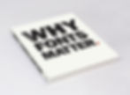
Sarah is the founder of Type Tasting and the author of books including Why Fonts Matter. She uses typography to create unique experiences and installations that transform how you think and feel. She is a TEDx speaker, appears on TV and radio, and is a judge for the D&AD awards. She has run workshops at SXSW, The Design Museum and for organisations across a wide range of industries. Sarah has published two studies in collaboration with Professor Charles Spence of the University of Oxford and is Heston Blumenthal’s multisensory type expert.
Find out more about Type Tasting on the website, Instagram and Twitter, and take part in experiments at the Type Tasting Lab.
Julia: What do you see as the advantages and disadvantages of free fonts?
Sarah: There’s a big difference between free, trial and well designed typefaces for commercial projects. All designers and students should make sure they know the difference. Free and trial fonts are great to visualise ideas quickly. Lots of type foundries, including the independent foundries, will give you access to trial versions of their fonts. But you get what you pay (or don’t pay) for. It’s also important to read the T&Cs before using ‘free’ fonts for commercial projects, or when modifying any font to create a logo (some foundries prohibit you from doing this).
While it didn’t breach the T&Cs, the flack aimed at James Cameron for using the ‘free’ font Papyrus for the movie title of the multi-million-dollar-movie Avatar is legendary (check out the Saturday Night Live Ryan Gosling sketch here).
As an industry we should all respect and support each other as creatives and this includes type designers. We need to make sure that we all get paid fairly and that we educate our clients about the importance of paying for well-designed fonts. If we want exciting new typefaces then we need to support type designers – especially the independent type foundries who create experimental and innovative new faces.
The flack aimed at James Cameron for using the ‘free’ font Papyrus for the movie title of the multi-million-dollar-movie Avatar is legendary.
Julia: How important is accessibility when you are working on a type project?
Sarah: Haha, this is something I’ve become more aware of as I’ve got older. That 8 point, reversed out of black, Helvetica ultra light on a restaurant menu is now impossible for me to read, especially in atmospheric lighting. “Size matters” is the comment I make in workshops with younger designers that gets the most groans, and I admit that my 20-something-year-old designer-self hated it when clients asked me to make the body copy larger. I would love to have pairs of glasses made that imitate how your eyesight changes with every decade. I would take these to my workshops so that designers could try them on for themselves. (I’d also post a set back in time to my younger self.)
I create events, installations and workshops for mainstream audiences so I get to see first-hand how people respond. I think it’s important not to make assumptions based on our own experiences, and to test our work on real and appropriate audiences.
Julia: Have variable fonts changed the way you work?
Sarah: It’s exciting how variable fonts have freed typography from the static medium of printed type, it feels like it’s taken a long time. Now type can move and respond in a way that suits the new medium. This has also inspired printed typography to become more experimental. I think of the Dada artists breaking out of the typographic grid, which was so revolutionary at the time, only now the letters can also move in time and space.
Julia: And I have to ask, if your life depended on you picking your favourite typeface, what would it be?
Sarah: If my life depended on it… Cooper Black would be the inflatable lifeboat I’d bob around in among the icebergs.
Lukas Paltram

Lukas studied graphic design in Austria where he discovered his love of calligraphy and typography. In 2008, he moved to London to work for the independent type design studio Dalton Maag. In the following years he designed typefaces for HP, Nokia, Ubuntu and Burberry. As Creative Director for Dalton Maag he led custom font projects for ABB, Amazon, BBC, Ducati, Facebook, Rakuten, Splunk, and his home city Vienna.
Julia: What do you see as the advantages and disadvantages of free fonts?
Lukas: As it's always been the case, there are big differences in the quality and language coverage of free fonts, so I would critically review a typeface before using it for a project to avoid surprises later, e.g. a missing accent to set a person's name, or a distorted euro symbol. I'd also like to point out that free doesn't always mean entirely free. Depending on who's releasing the fonts some restrictions might apply, like limited character sets, formats or styles, and even some aspects of commercial use. But over the last years there have been great efforts to build libraries that collect good quality open source fonts that the user can work with without hassle. And I think that creates amazing opportunities. For designers on projects with smaller budgets; for users of languages that don't have hundreds of thousands of fonts to choose from; or for private users that are not content with system fonts. For corporations it can be equally useful, but if there's a desire for uniqueness in the brand expression it won’t always be the right route.
Julia: How important is accessibility when you are working on a type project?
Lukas: We're often confronted with questions regarding accessibility in type, and they become more frequent every year, so there's certainly more awareness of the importance of the subject. It's also very complex; what I have learned is that subjects like readability and legibility are highly person-dependent, and can also vary between writing systems. I would be careful if you read all-encompassing advice on what's right and what's wrong for all users. I believe that, as much as the content we consume, over the next few years, design will have to become more adaptive to the user's requirements to improve accessibility, and that we should be prepared for that.
There has been more creative development in type design in the last five years than in the 15 years before.
Julia: Have variable fonts changed the way you work?
Lukas: Absolutely. We've adapted the technology since its very early days, by now all of our families are developed with a "variable-first" approach. This has helped to not only increase the quality and consistency of design, but has also instilled a more creative way of thinking in typographic systems. Restrictions and opportunities in the technology require new ways of problem solving. There has been more creative development in type design in the last five years than in the 15 years before. That's extremely encouraging and exciting.
Julia: And I have to ask, if your life depended on you picking your favourite typeface, what would it be?
Lukas: There are many, but if my life depended on it, I'd say the original version of Univers. It was a typeface that was ahead of its time that built the foundation for modern font design. It put the system over the individual letter or style, without Frutiger's work we would definitely not talk about typographic axes in Variable Fonts today.

Olivia Kane

Olivia is a senior designer at the NYC design studio ThoughtMatter and a co-host of The Weekly Typographic podcast. On the podcast she hopes to make the design world more accessible by sharing the latest industry news, diving deep into some nerdy type topics, and chatting with talented type designers and educators innovating the field. In her career as both a freelance and full-time graphic designer she’s worked across several industries (with clients ranging from Velveeta to The Whitney Museum) but no matter the type of work, she’s always excited to be part of the cultural conversation.
Julia: What do you see as the advantages and disadvantages of free fonts?
Olivia: Free fonts have certainly had a fraught history in our digital age. There was a time when most of the free fonts available were pirated versions of retail fonts, or they were very low quality, or both those things! But I think our free font landscape today is extremely different than it was even 10 years ago. I think this is thrilling and it gives me a lot of optimism for the future generation of designers.
The biggest advantage of free fonts today is the accessibility component. I was very limited in college to the fonts that were available to me on my computer or in the computer lab. Today, students have thousands of typefaces at their fingertips that bulk up their proverbial “design toolbox” and help push along their education. And because of open-source initiatives like The League of Moveable Type (the first ever open-source foundry that was founded by my podcast co-host Micah Rich), Google Fonts, and Velvetyne, students are able to explore and experiment more with typographic choices that move beyond the cookie cutter font library we were all trapped in. And even better, when a typeface is open-source, a student can go into the font file and understand the inner-workings of the technology and craftsmanship behind the typeface. That in itself is a major advancement for graphic design and type design education.
The first obvious disadvantage with free fonts is that you have to be cautious about the quality of the font. Sometimes you have to do quality control and make sure there's a full character set, check that the spacing looks even throughout the characters, and so on. But again, now that there are foundries committed to offering free and open-source type, a lot of free fonts are vetted for those kinds of things before publishing. Another free font disadvantage is that you might not find the perfect match for your project. There are tons of free fonts but your options go up exponentially when you look at all the retail fonts available.
When a typeface is open-source, a student can go into the font file and understand the inner-workings of the technology and craftsmanship behind the typeface. That in itself is a major advancement for graphic design and type design education.
Julia: How important is accessibility when you are working on a type project?
Olivia: While working on type for packaging design, I've found accessibility to be incredibly important. When you're working on a product that is mass market and will eventually be found in the majority of grocery stores in the country, accessibility has to be front of mind. And even if some aesthetics have to be compromised, a packaging designer is legally required to consider accessibility. Typography for text like the flavour name has to have clear contrast with its background and can't go below a certain point size. I've had to change coloured components to black and white to make sure certain nutrition facts could be clearly seen. And these changes are always for good reason at the end of the day — if something is read/interpreted incorrectly, that could be at the detriment to the consumer's health! Especially when you consider people living with serious allergies or food restrictions. With that said, in certain instances where I've had to sacrifice typographic aesthetics for accessibility, I'll keep a different version of the packaging design in my personal portfolio that is maybe less accessible but I think better shows off my design sensibilities to people reviewing my work.
I also think there's also a large responsibility for a type designer to build accessibility into their font if it's meant to be used in more functional (rather than experimental) circumstances. That means clearly differentiating characters that are otherwise similar. For example if a type designer is making a sans serif font, they should make sure the numeral (1), the uppercase (I) and the lowercase (l) have individualistic features so a reader doesn't confuse them.
Julia: Have variable fonts changed the way you work?
Olivia: Variable fonts haven't changed the way I've worked, because I rarely use them! Circle back in a couple years and we'll see if things have changed. ;)
Julia: And I have to ask, if your life depended on you picking your favourite typeface, what would it be?
Olivia: Cooper Black. An absolute classic that looks just as good on a Tootsie Roll wrapper as it does on an iron-on t-shirt. And who can resist it with all its soft corners and blobby charm!?

Seb Mclauchlan
Seb is an independent designer based in London, specialising in the fields of graphic & type design. Since 2018 he has released his typefaces exclusively through Dinamo Type Foundry. He has also previously been a lecturer teaching type design at Kingston School of Art.
Follow Seb on Instagram.
Julia: What do you see as the advantages and disadvantages of free fonts?
Seb: I think it’s quite easy, as someone who makes his livelihood through selling typefaces, to look at free fonts as a corrupting influence on an honest trade. But I think demonising them misses the crucial role that free fonts have for students, at university and earlier even at secondary education. £60 per weight of a typeface doesn’t seem like much to a professional graphic designer, or a large agency, but they’re a barrier to developing skills for designers at a crucial stage of their journey. Websites such as DaFont are now the butt of jokes, but I think it’s undeniable the influence that this has had on now generations of young designers.
Of course, that doesn’t mean I’m not worried about seeing my work copied or reverse engineered, and bigger players like Google potentially taking a lot of casual business from type designers – but I’m not sure it’s all as bleak as some make it out to be.
Demonising them misses the crucial role that free fonts have for students, at university and earlier even at secondary education.
Julia: How important is accessibility when you are working on a type project?
Seb: Accessibility and applicability is crucial to a typeface being successful. As difficult as it is at times, it’s so important that we as English-speakers recognise how broad an audience our typefaces reach, and put as much effort into understanding those contexts and accommodating in our design, as we do in making it palatable for our own tastes. I can’t say yet that I’m happy with my contributions in this space, and it will continue to be something I wrestle with going forward.
Julia: Have variable fonts changed the way you work?
Seb: I’ve found that both my concept phase and workflow have both been significantly changed by variable fonts, and their precursor: multiple masters. Instead of thinking as a typeface composed of a multitude of distinct weights, variable fonts force you to consider your design as a spectrum or space. However in my opinion there are drawbacks to this approach, it often feels harder to achieve a specific feeling of usefulness with every one of your weights.
Julia: And I have to ask, if your life depended on you picking your favourite typeface, what would it be?
Seb: Hmm, I take “my life depending on it” as needing to perform or make something that’s undeniable in its communication. So, although it’s quite boring and masculine of me to choose this, for those reasons I have to choose Helvetica, specifically Helvetica BQ Roman.
Thank you to Julieta Ulanovsky, David Pearson, Sarah Hyndman, Lukas Paltram, Olivia Kane and Seb Mclauchlan for sharing their views.