Brighton Festival
Brand identity for Brighton Festival: the 3-week-long arts celebration taking place annually each May; and sister organisation to Brighton Dome.
The overall identity needed to be related but distinct from the Dome, so it made sense that the logo also became an initial.
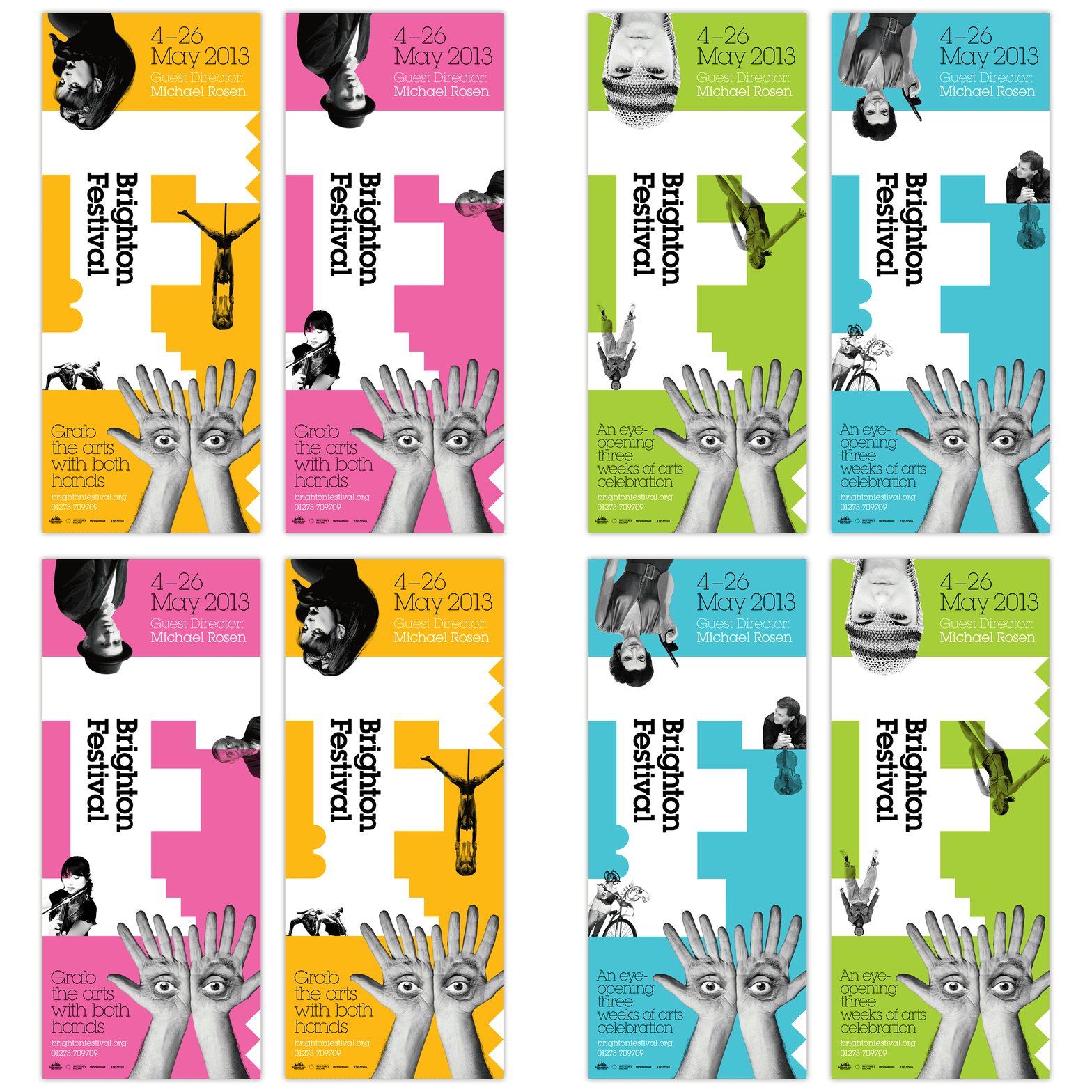
The F logo has a series of different ‘serif’ iterations, sometimes reflecting the scallops on the Dome's D, but at other times feeling a bit more edgy like the festival itself, with brutal geometric shapes perhaps reminiscent of stage steps or bunting.
The F logo is used flexibly in any colour, to suit the genre of the specific design, from dance and theatre performances to spoken word or comedy events. It is paired with the geometric typeface Lubalin for the lead typography.
In addition to the main visual identity, a different campaign is required for each year’s guest director representing their theme. In 2013 poet Michael Rosen had a ‘Bauhaus’ theme so the lead image became a portrait of Rosen's hands and eyes to create a homage to Herbert Bayer’s ‘The Lonely Metropolitian’. In 2015 author Ali Smith explored migration in her programme, so the lead image became a swift’s shadow over Brighton.
Each year the lead image is translated across various media, from the usual print and online promotions to more unusual applications such as street art.


